Schema Form
JSON Schema Form is a standard data structure to create declaratives complex forms. We added some extra parameters to be used in Prisme.ai platform.
Basic usage
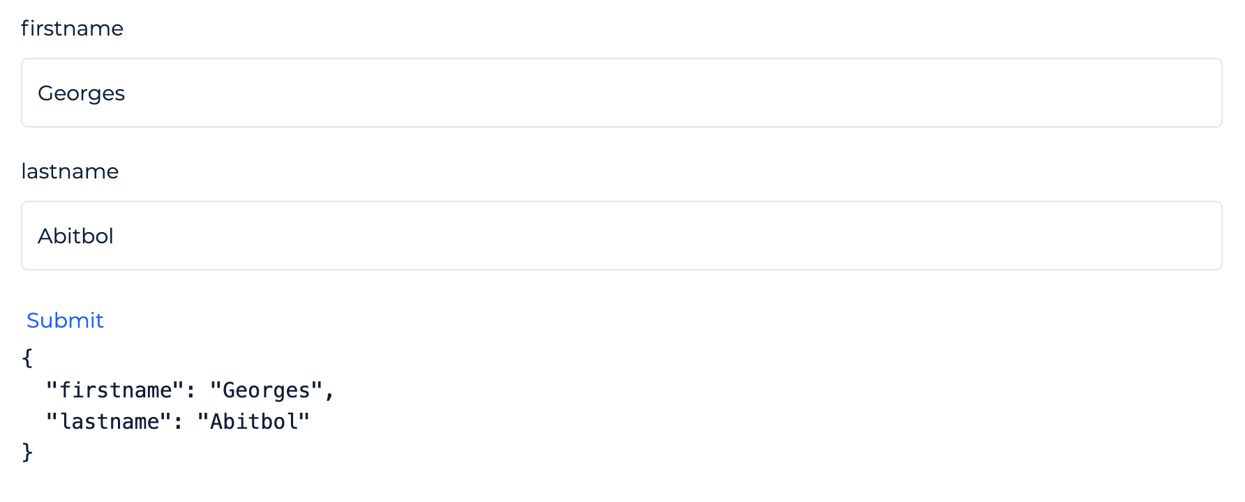
A schema form start from a single field. This field can be of object type and this will be the better way to build a form :
type: 'object'
properties:
  firstname:
    type: string
  lastname:
    type: string
This simple structure will make a form with thwo fields and the final value will be an object with two properties : firstname and lastname :
Define a field
The root object and all its children are made with the same structure:
type: Determines the type of the value and the rendered input. Can be:string: Text value with a text input.localized:string: Text value with translations in any languages.number: Number value with a number input.localized:number: Number value with different value for any language.boolean: A switch button for a true/false value.localized:boolean: Different boolean values for any languages.object: An object. This type may comes other properties (see below).array: An array. This type may comes other properties (see below).
title: Field label as a string.descriptions: Text displayed in the (i) button as a tooltip. You can set a longer text here to help your user.add: Optional label for add item button when your type isobjectorarray.-
remove: Optional label for remove item button when your type isobjectorarray. -
properties: Comes with theobjecttype. Defines each properties the object may have. This object takes any property as the child field name and a newSchema Formas value. additionalProperties: Comes with theobjecttype. Let user adding any other property to the object. Value can be:true: Any new property added to the object can have any value.- a new
Schema Form: which describe the structure of the new property value.
items: Comes with thearraytype. Defines format for each items value. Value is a newSchema Form.enum: Utility to restrict for a list of values. Takes an array of values. Display a select drop down.enumNames: Optional list of labels displayed in place ofenumvalues. Takes an array of strings in the same order of value it represents.default: Optional default value.hidden: Set to true if you want to hide the field.pattern: A regular expression to validate the value choose by user.errors: An object with a list of validation error message. Key is the validator name and value is a string which will be displayed. ex: `{ pattern: "Value cannot contains numbers"oneOf: Let the user choose between any options and have different child fields. Takes an array ofSchema Form. Display a select drop down with the title of each child. (See more)ui:widget: You can set a different input with this attribute. Each type comes with some alternative inputs and you can pass a React component if you write yourSchema Formas javascript.- string type:
textarea: Replaces the text input by a textarea for more space.date: Display a date input with a calendar picker. The value will be a stringified date.color: Display a color picker.autocomplete: Display a text input with autocompletion.upload: Display a file picker. Set the choose file as data-URI format as field value. You'll probably need to upload your file and replace it with a URI before submitting the form.radio: works withenum, then display a list of radio box instead of a select.html: Display a WYSIWYG editor to generate HTML content.password: Displays a password field which hides the content, also adds a toggle to show the content.
- localized string type:
textarea
- any type:
block: Display any Block available in your Workspace- A javascript React Component. Only for Blocks developers who want a custom field they made.
- string type:
ui:options: Some options for field types and widgets:- type array:
array: Can takerowvalue to display each item in row instead of column.
- type object:
grid: array of array of array
- oneOf option:
oneOf:
- widget textarea:
textarea: any attribute of TextArea HTML Element.
- widget upload:
upload: Object with property:accept: string describing file types allowed to be picked by user in file picker. (see MDN)
- widget html:
html: Object with property:htmlModeOnly: set totrueif you want to show only HTML Code editor. Leave it undefined to let user switch between wysiwyg and code editor.
- type string;
autocomplete: Source of autocomplete values. Can be:- "events:emit": Retreive all events emitted by current workspace and all its installed apps
- "events:listen": Retreive all events listened by current workspace and all its installed apps
block: slug property is mandatory. Any other property will be passed to the Block. You can interpolate{{formValues}}in your Block config to get the current form values as an object.updateValue: Helps your field to be updated from anywhere in your page from the events. Set theeventattribute to tell which event to listen to, and optionnaly set aselectorto pick the right value in the event payload. When the event fires, the payload (or its selection) will be set as the value of this field.- or any other key/value to be used with your custom widgets.
- type array:
extends: Copy some schema from another Blockextends.block: Block name to copy schemaextends.path: Path from schema form root, if you want to pick only a single part.
Example
type: object
title: My Cool Form
description: This is an exemple of form
properties:
  firstName:
    type: string
    title: Firstname
  lastName:
    type: string
    title: Lastname
  birthdate:
    type: date
    title: Birthdate
  genre:
    type: string
    title: Genre
    enum:
      - 1
      - 2
      - 3
    enumNames:
      - Man
      - Woman
      - Other
  address:
    type: string
    ui:widget: textarea
  hobbies:
    type: object
    title: Your hobbies
    properties:
      favoriteMusic:
        type: array
        title: Favorite music
        items:
          type: string
          title: Type an artist name
oneOf
This helper display a select with a list of labels. It's more than enum and enumNames because the selected value can alter the structure of the schema. It is an array of schemas describing the properties to merge with the parent.
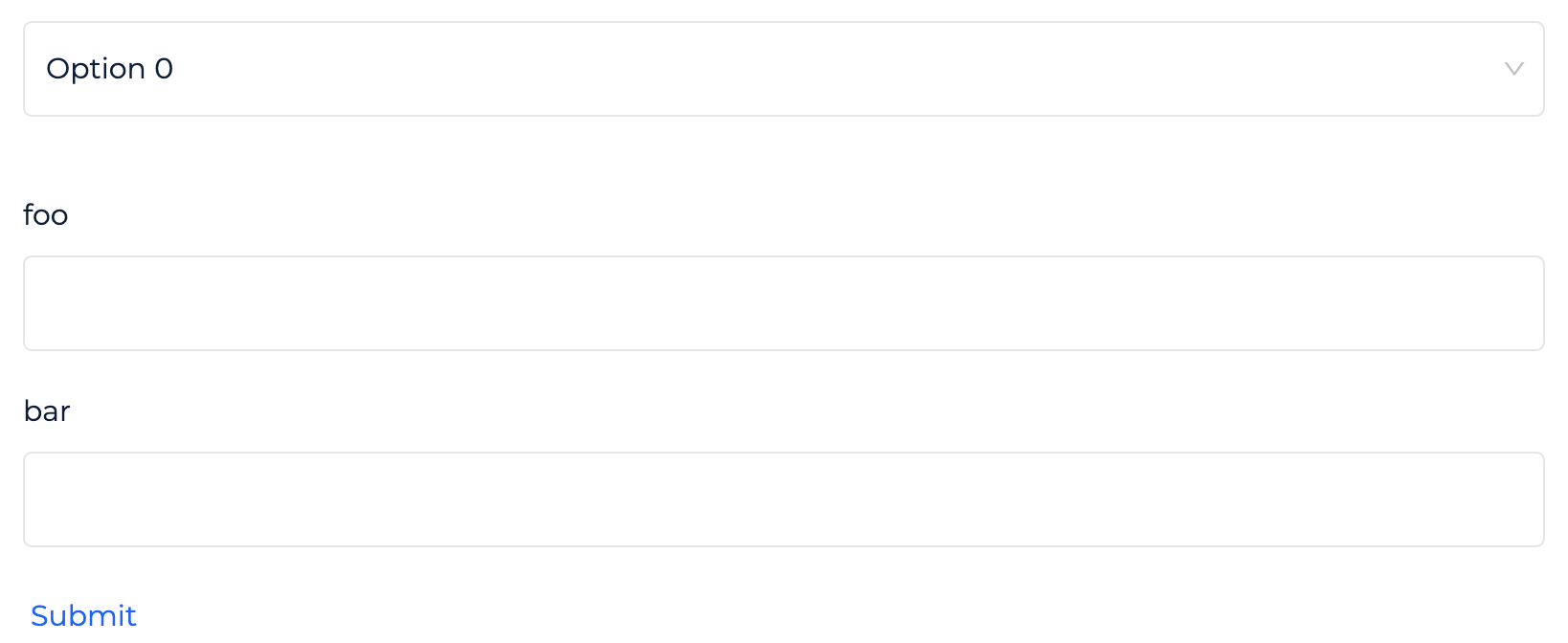
Example
type: object
properties:
  foo:
    type: string
oneOf:
  - properties:
      bar:
        type: string
  - properties:
      bar:
        type: number
      babar:
        type: string
Will display an input "foo", then a select with "Option 0" and "Option 1" labels. The first option will add a new field "bar" of string type. The second option will display a "bar" field of number type and a "babar" field of string type.
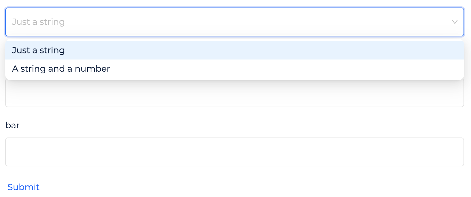
The label can be set with the title property :
type: object
properties:
  foo:
    type: string
oneOf:
  - title: Just a string
    properties:
      bar:
        type: string
  - title: A string and a number
    properties:
      bar:
        type: number
      babar:
        type: string
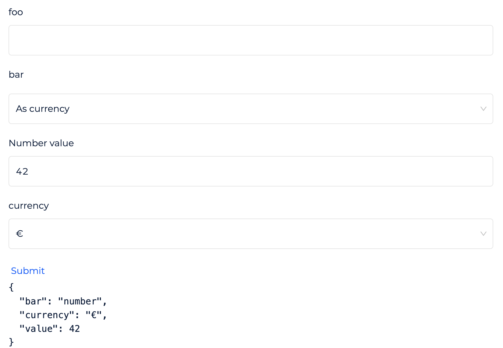
More, you can alter the current object field by setting only a oneOf property in one of your field property. This makes possible to place the select in a specific position :
type: object
properties:
  foo:
    type: string
  bar:
    oneOf:
      - title: As string
        value: string
        properties:
          value:
            type: string
            title: String value
      - title: As currency
        value: currency
        properties:
          value:
            type: number
            title: Number value
          currency:
            type: string
            title: Currency
            enum:
              - €
              - $
              - ¥